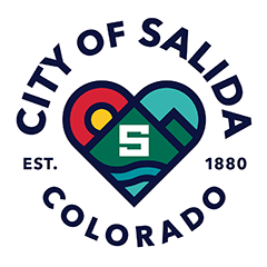
During the Salida City Council meeting on October 5, the council voted to approve a new city logo. The goal of this project was to create a new logo that better represents the City government organization. This new, circular logo incorporates the city’s historic founding, and the heart at the center includes the mountains, the river, and the city’s iconic “S” mountain in the middle of everything.
“Sitting through the design committee meetings, I wasn’t able to add a whole lot because I felt like a kindergartener sitting there with a bunch of PhDs. The thought and the comments and the input that folks like Bill [Donavan] and a number of other true professional designers in our community brought to this was awe-inspiring,” said Mayor Wood.
As part of the initial discussions of the city’s old logo, it was acknowledged that the City of Salida is changing and that the current logo no longer reflects the City’s unique and vibrant culture or identity. In March 2021, the City began an inclusive process to redesign its current municipal logo expressing the following reasons:
- The current logo was created before 2008 and has become outdated over time.
- The current logo was designed without a cohesive brand, and brand guidelines were never incorporated, leading to inconsistent logo use.
- Production of the logo on apparel, signs, and other digital materials does not reproduce well, often resulting in additional printing costs and other issues.
- The current logo doesn’t fully represent the City government organization, its responsibilities, or its core values.
Requirements included that the logo design must be flexible and work in various applications, including buildings, signage, vehicles, apparel, printed material, and online/digital formats.

Image courtesy of the City of Salida.
Project management and oversight has been led by Slate Communications, the City’s communications consultant partner since 2019, with input and guidance from City staff. The council received a presentation from Kristen Knoll, Senior Communications Strategist with Slate Communications on the project.
Bill Donavan a local who was on the logo committee explained, “Having lived here for over 20 years… one of my goals was to help generate a logo that met my high standards as a designer but also as a local. I was impressed with the process; it was beyond thorough. [Knoll] and the city were open to input and discussion, they were extensive and exhaustive. The committee was super varied and included some very opinionated locals; so, for anyone who is concerned, there was a lot of debate and a lot of discussion.”
From March to May of 2021, city staff met with Slate Communications to develop a logo redesign process that incorporated input from residents and allowed local graphic designers to create a new logo. A Brand Committee was established.
From May to June, stakeholder interviews were held with residents, business owners, and artists to gather insights about the community. The Brand Committee made up of local graphic designers, artists, community leaders, city staff and City Council members met five times beginning in May.
From July to August 2021, local graphic designers who reside in Chaffee County were invited to submit portfolio work. Their work was critiqued by the logo Brand Committee using a Design Matrix. Twenty-one local designers responded to the opportunity and submitted their artwork. The top two local graphic designers, with the highest overall scores from the Scoring Matrix, were invited to create new logo options for the Committee’s consideration.
In August the two local graphic designers, and graphic designers from Slate Communications, spent about a month designing eleven logo options for the Committee to review.
In September, Slate Communications presented the logo options to the Committee and the field of logos was narrowed down to five. The top logos were edited at the Committee’s request and reviewed again at another Committee meeting.
The top three logos were then shared with the community for review and feedback via an online visual survey. Survey responses voted strongly in favor of the logo that ultimately was chosen.
The Brand Committee selected that top logo from that process for Salida City Council approval, pointing out that the chosen logo design meets all the requirements and goals of the project and is a strong visual representation of the city organization.
City Administrator, Drew Nelson explained “From a staff person perspective I really appreciate the ferocity that Bill and others approached this with. They were really looking for the community as a whole and I think that’s an important thing. We really want to showcase who we are as an organization but also all the things that we offer here in Salida.”
Slate Communications will work with city staff to develop and implement the schedule for updating the logo. The next steps include updating the brand guide that Slate Communications created in 2020 with all the new logos details, identifying secondary and tertiary colors, and proper use and placement of the logo in all its capacities across the plethora of mediums on which the logo appears, or should appear. It was pointed out that this is a long process and won’t happen overnight. They will work to identify the biggest graphic needs and financial considerations for physical signage on buildings. Digital updates can be done more quickly.
“We want to have a process that really meets the needs of the city and the city’s priorities,” said Knoll.


Recent Comments